Case Study
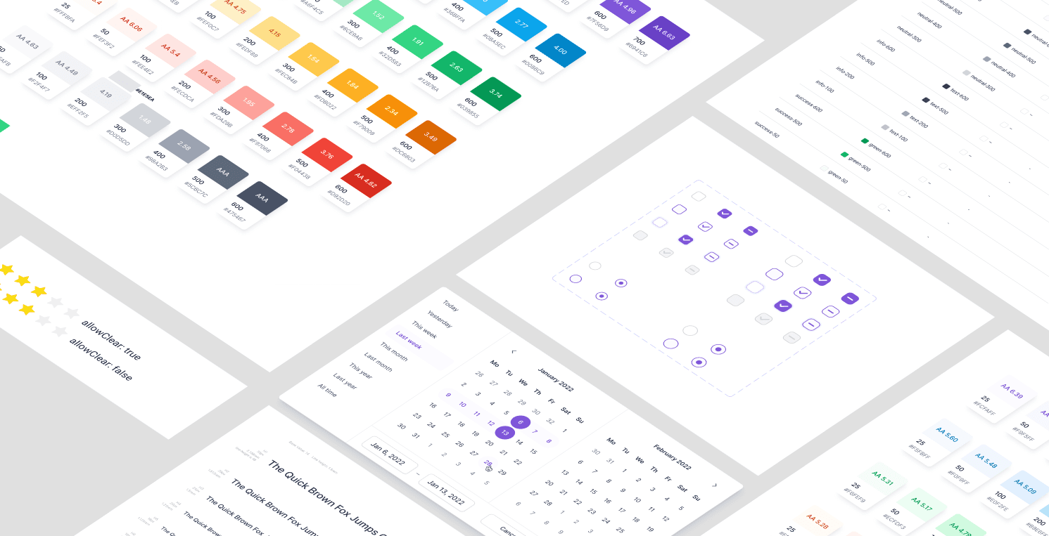
Project Overview:
This case study explains how I made a design system for our admin dashboard. The goal was to fix design mistakes, speed up work for designers and developers, and make the user experience consistent
My Role:
Senior UI/UX Designer
Responsibilities :
All UI/UX design, creating the design system, making a component library
Problem Statement
Inconsistent Look: Parts like buttons and forms looked different on different pages. This made the app feel unprofessional and was confusing for users.
Slow Development: Developers had to build the same parts over and over for new features. This was a waste of time and made it take longer to release updates.
No Single Guide: Designers and developers didn't have one place to look for the correct designs. This led to a lot of confusion and mistakes.
Hard to Grow: As we added more features, things got messier. It was becoming very difficult to add new things without breaking the old ones.
The Solution
The solution was a design system that acts as the one main guide for everyone. It has all the rules and a library of ready-to-use parts.
Research & Discovery
Conducted comprehensive market research and competitor analysis to understand enterprise design patterns and user expectations.
Developed design principles and strategic direction focusing on trust, clarity, and enterprise-grade professionalism.
Design & Iteration
Created comprehensive color system, typography, and UI components with multiple iterations.
Implementation & Launch
Deployed the new design system across all platforms.
We started by doing a deep UI audit. I indexed each and every screen and component in the Figma dashboard file. This audit revealed a number of inefficiencies, usually more than one version of the same button or input field, that we knew could be consolidated.
This audit was useful in pinpointing the areas in which improvements were most needed: standardizing on color usage, creating a single typogrphy scale.
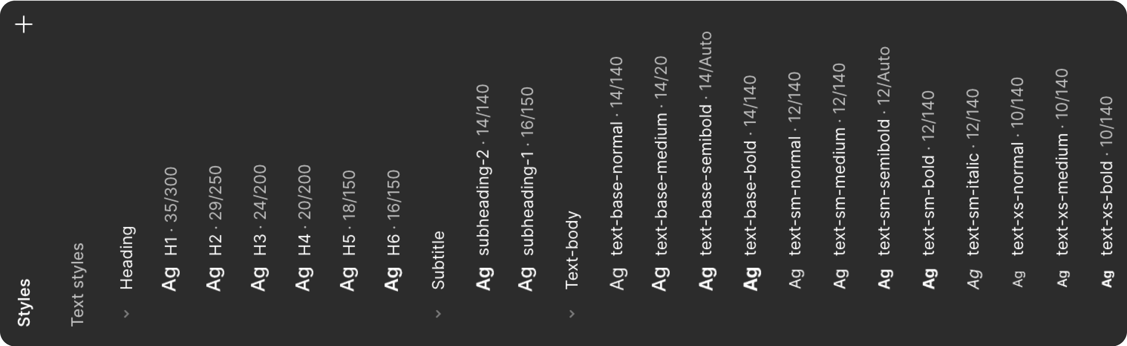
In this section, we explore how typography plays a vital role in creating a consistent and readable design. By defining font styles, sizes, and weights, we ensure a seamless experience across all components of the design system.

The Inter font was selected for its exceptional readability, modern appearance, and adaptability across various platforms. Its clean contours and balanced proportions ensure a smooth and comfortable user experience, making it ideal for digital interfaces.
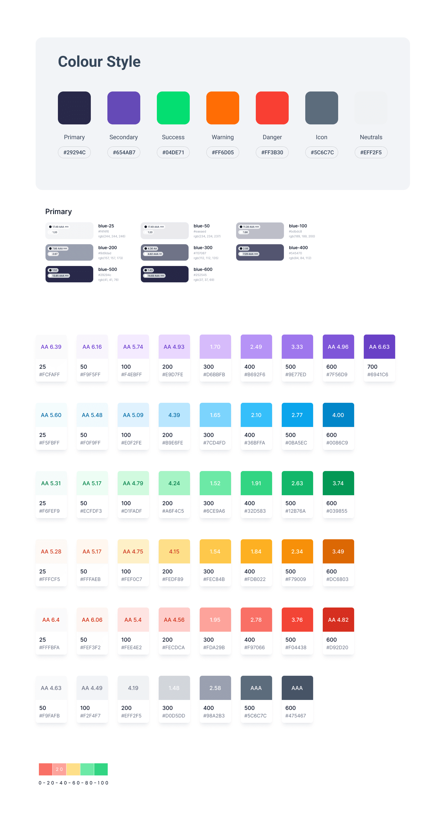
Created a set of official colors for the brand, along with special colors for messages like "success" (green) or "error" (red).
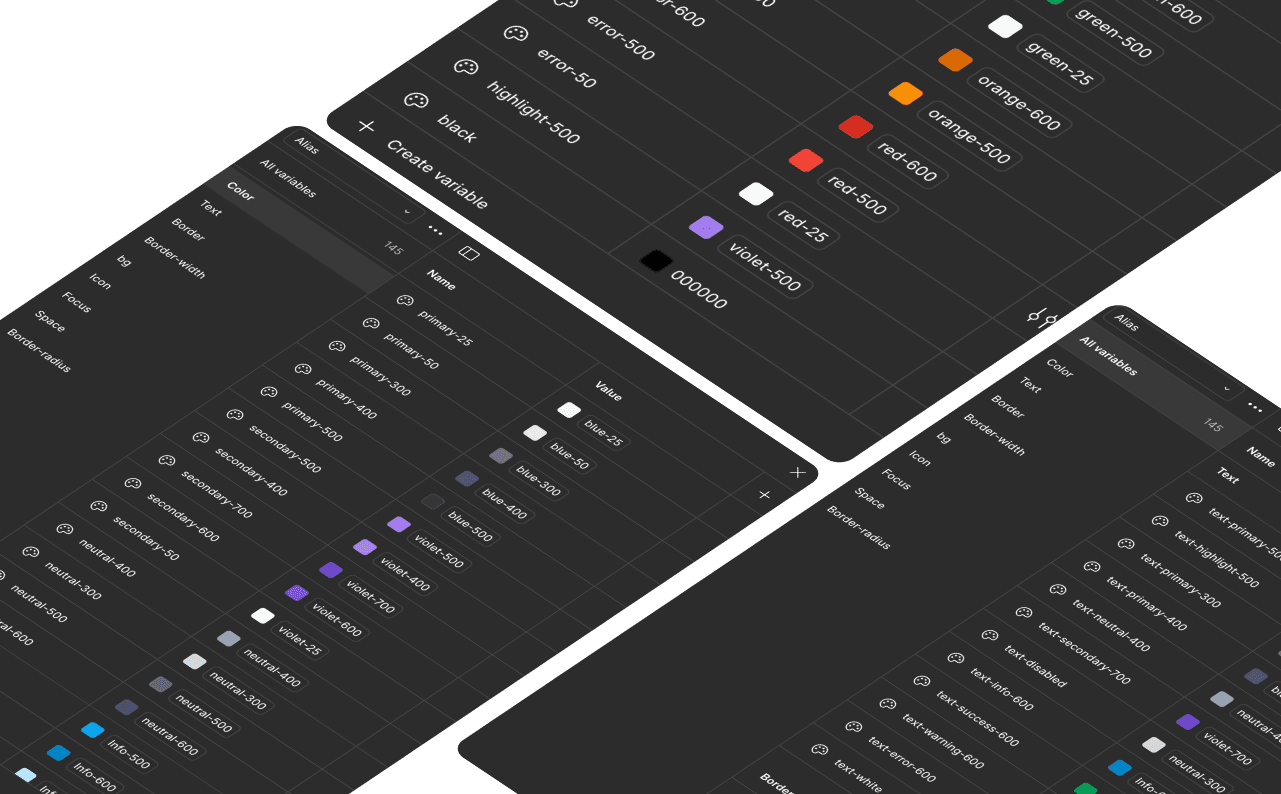
Using global styles for colors enables centralized management, ensuring consistency across all interface elements. This allows for quick changes that automatically apply to all components, offering greater flexibility and efficiency compared to regular styles, while simplifying future maintenance and adaptation.
The component library was developed in Figma using the latest features like nested components, properties, and variants. Each component was:
Responsive and constraint-driven
Mapped with interactive states (hover, disabled, focus). Components were categorized clearly (forms, buttons, navigation, tables) making them easy to browse and adapt.
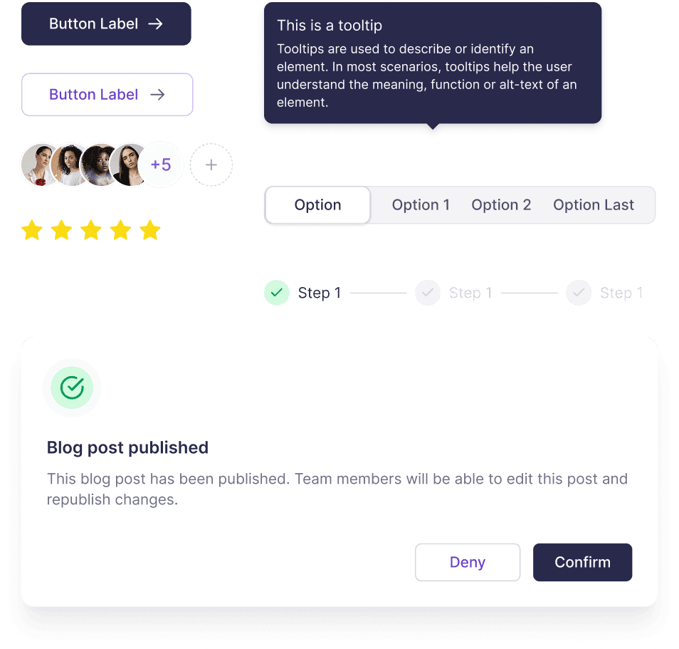
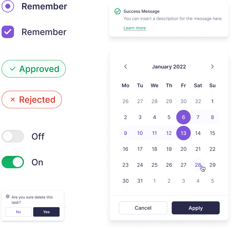
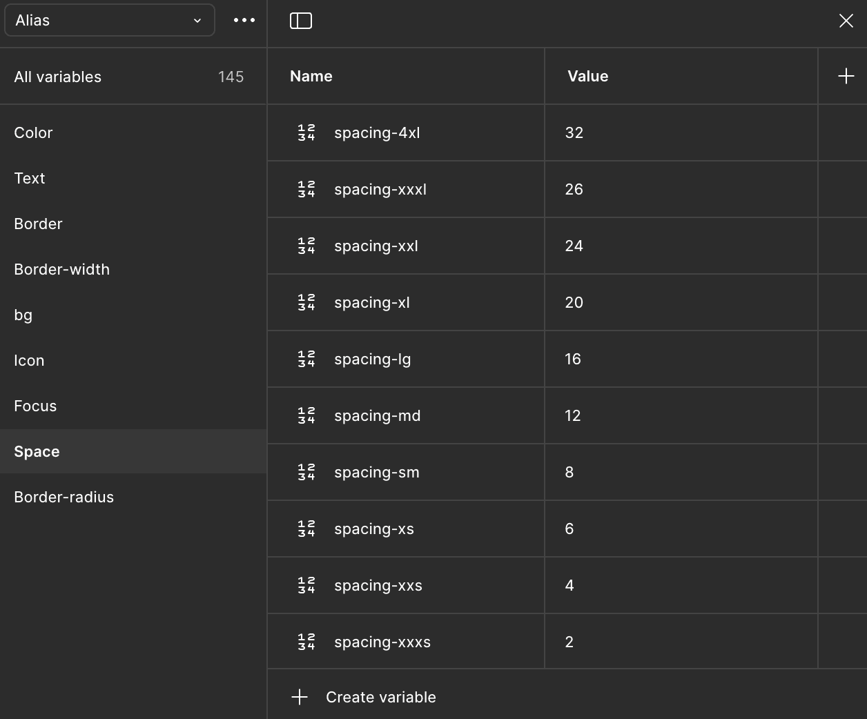
I used a simple grid to decide how much space to put between elements. This makes the whole dashboard look neat and clean.
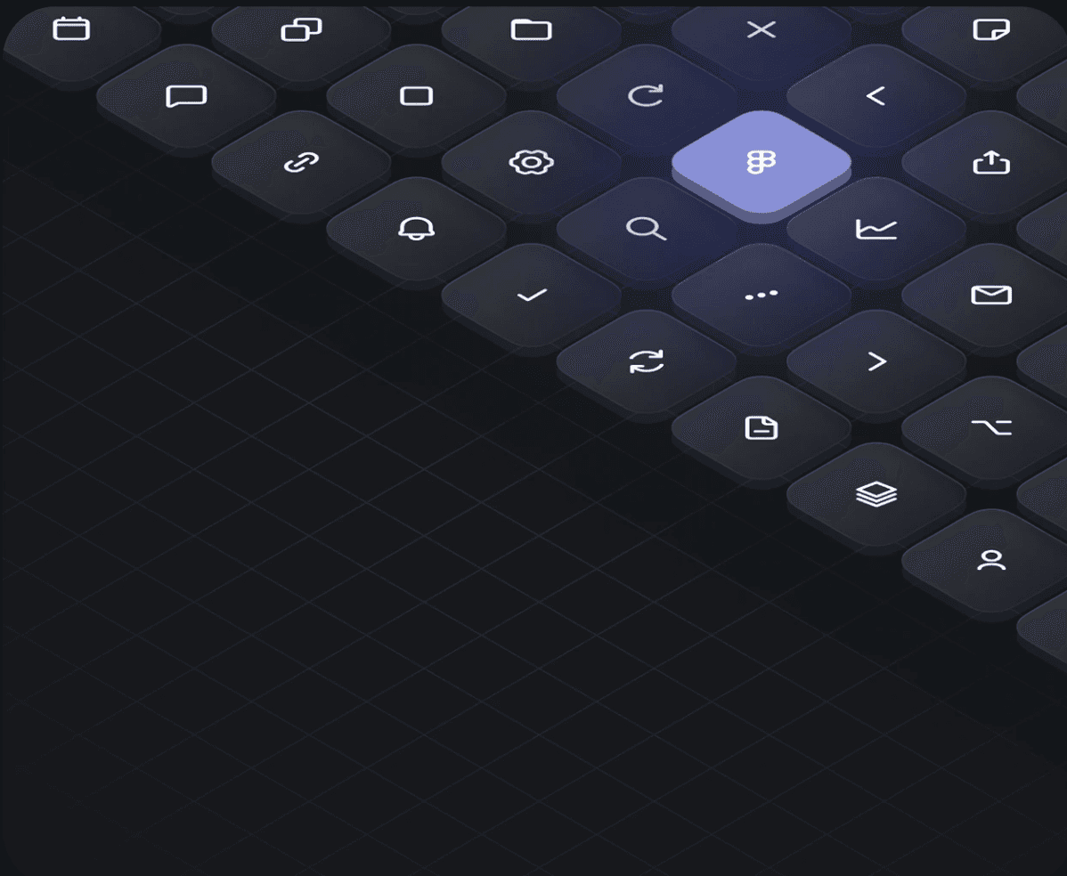
I picked one set of icons to be used everywhere for the same actions.
Buttons are key interactive elements that prompt users to take action. Our button styles are designed to be clear and consistent, so users always know what the most important next step is.
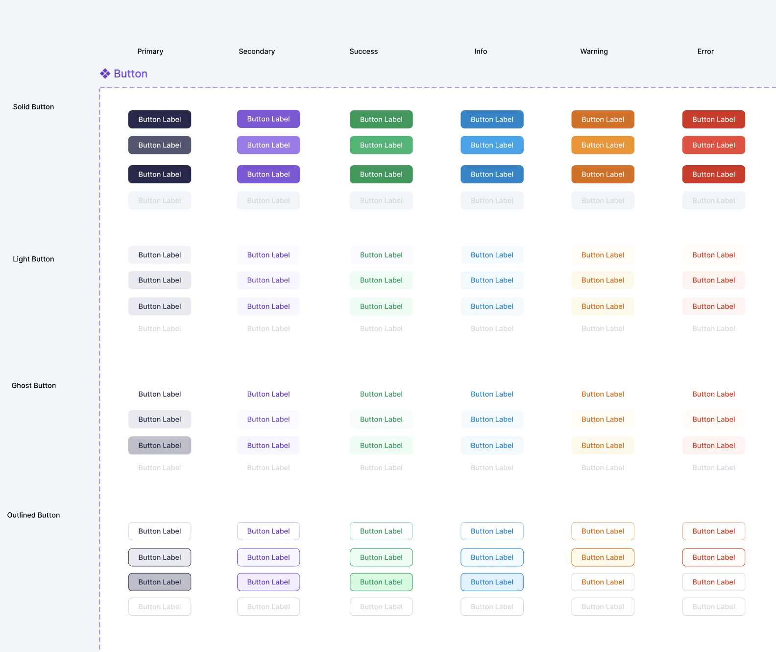
The final design system delivers a cohesive enterprise experience that builds trust while maintaining modern design principles and accessibility standards.
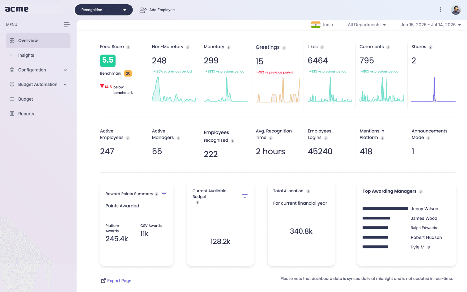
Before images of the desktop
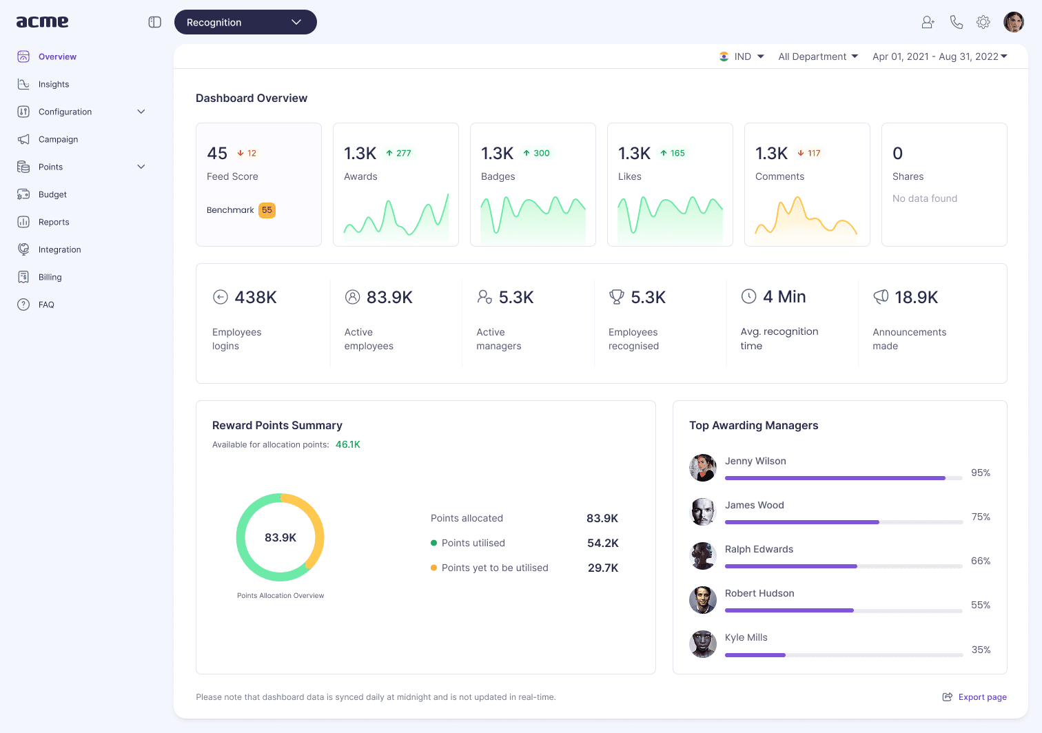
After images of the desktop
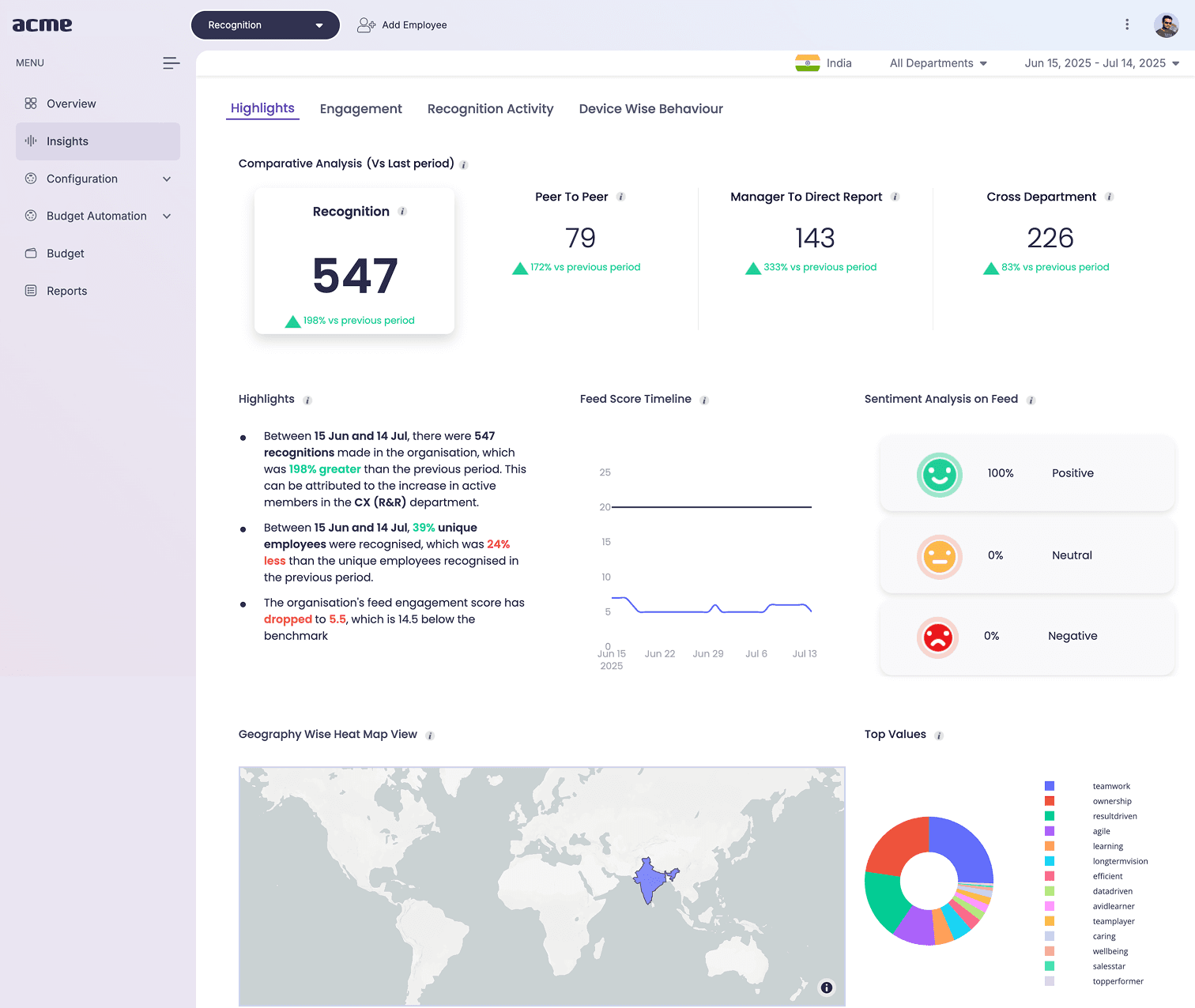
Before images of the desktop
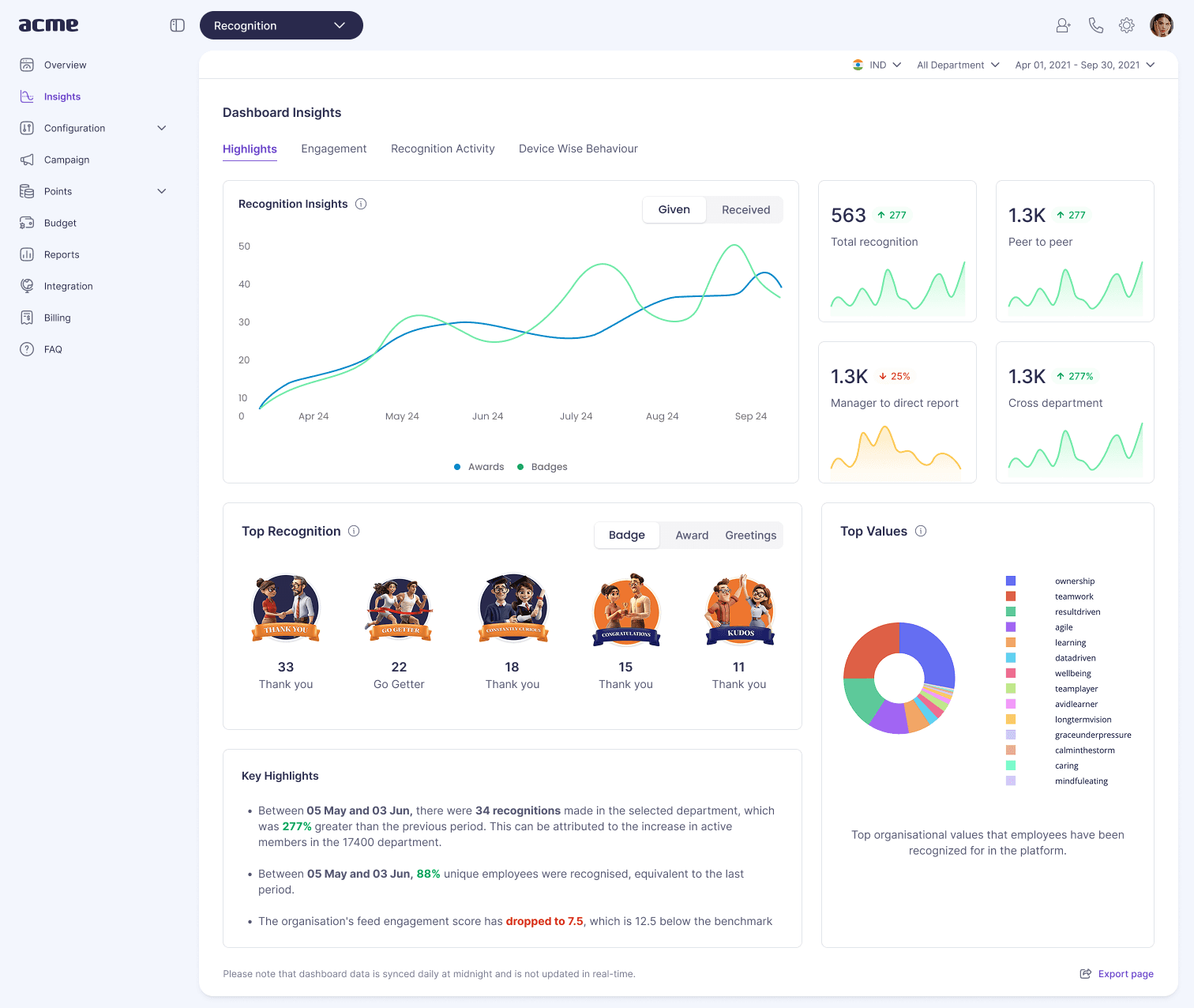
After images of the desktop
The rebrand delivered measurable business impact, establishing Flowtrix as a trusted enterprise solution provider and driving significant growth in target markets.
150%
Increase in Enterprise Inquiries
Significant boost in qualified enterprise leads following the rebrand
85%
User Satisfaction Improvement
Higher user satisfaction scores and positive feedback on design clarity
40%
Faster Decision Making
Reduced time-to-decision for enterprise clients due to increased trust
Building the design system was a very important step for us. It fixed our problems and gave us a strong base to grow the product in the future. This design system helped us reduce confusion and bring everyone on the same page.
A design system is its own project.
It needs to be taken care of and updated over time, just like any other product.
Teamwork is key.
It was important to have developers involved from the start to make sure the system worked well for them too.
Good notes are very important.
The design system is only useful if people know how to use it. Clear instructions were key to its success.